Jot Contact Manager™

Overview

Jot Contact Manager™ is a pocket CRM app that is designed to help you make more meaningful connections during networking. In Jot Contact Manager™, you can take notes on specific contacts and get a digital contact card to share with others. You can also add tags to contacts to segregate them into different lists. I was tasked with a overhauling the app's UI and creating a new visual design system.

The Problem

The Jot Contact Manager™ app was lacking in popularity. Although people saw the value in the app, many of them decided against using it due to the clunky UX and outdated looking UI. As a result, we had a high churn rate, and a very low conversion rate for paying customers. Christie Kwan - the senior designer - and I were tasked with redesigning the app to look more modern, and improve some of the UX issues plaguing the app.

The Challenge

How can we create a new visual design system for the Jot Contact Manager™ app that would attract more paying customers and reduce our churn rate?

The Solution

Our solution was to create a completely new visual design system and overhaul the app's outdated branding. We also changed the call-to-action buttons to be more enticing, as well as removed unnecessary buttons. I also introduced a mascot for the app: Kevin, to guide users through the onboarding process, and act as the official persona for Jot™ Support. Finally, we introduced gamification through an achievements and leaderboard system to incentivize users to regularly use the app.

Figure 1 - Some components from the new proposed visual design system.

Figure 2 - New home screen prototype.

Figure 3 - New contact screen prototype.

Project Phases

Phase 1 - Research and Revision

✦ Heuristic Review

First, we conducted a heuristic review to determine the usability of the current UI. This review allowed us to determine which parts of the app had UX problems, giving us a good idea of what app components to target. We specifically evaluated the home screen page and the contact page, which are the two most important and representative screens.

We found that most of the issues were in the design and layout of the app, as well as the coherence and mental workload. Briefly, there was too much information being presented at once, with bright colors that take away the attention from key action items. There were also problems with hierarchy and information legibility.

✦ User Interviews

Next, we conducted user interviews to gather feedback about the app’s current UI and UX. Based on our campaign at the time, our main audience was university students who cared about networking and want to differentiate from their peers. We tabled at the University of Toronto, Scarborough to gain feedback. Over 90% of the users claimed that our app UI was “ugly” and “outdated”, while around 50% had a hard time grasping the app’s use-case from viewing the home screen and listening to some background information. The user interviews confirmed the findings from our heuristic evaluation

Phase 2 - Ideation

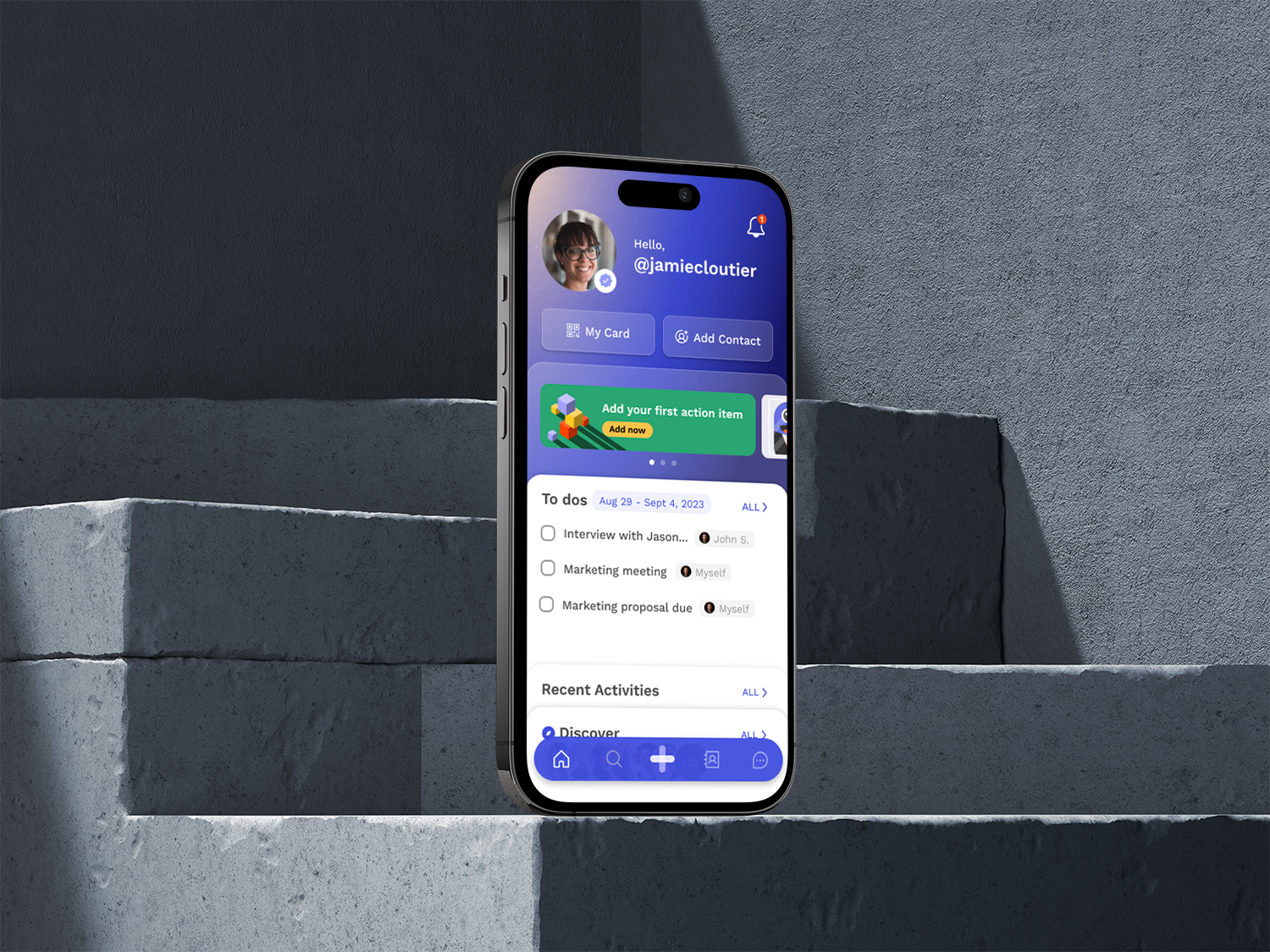
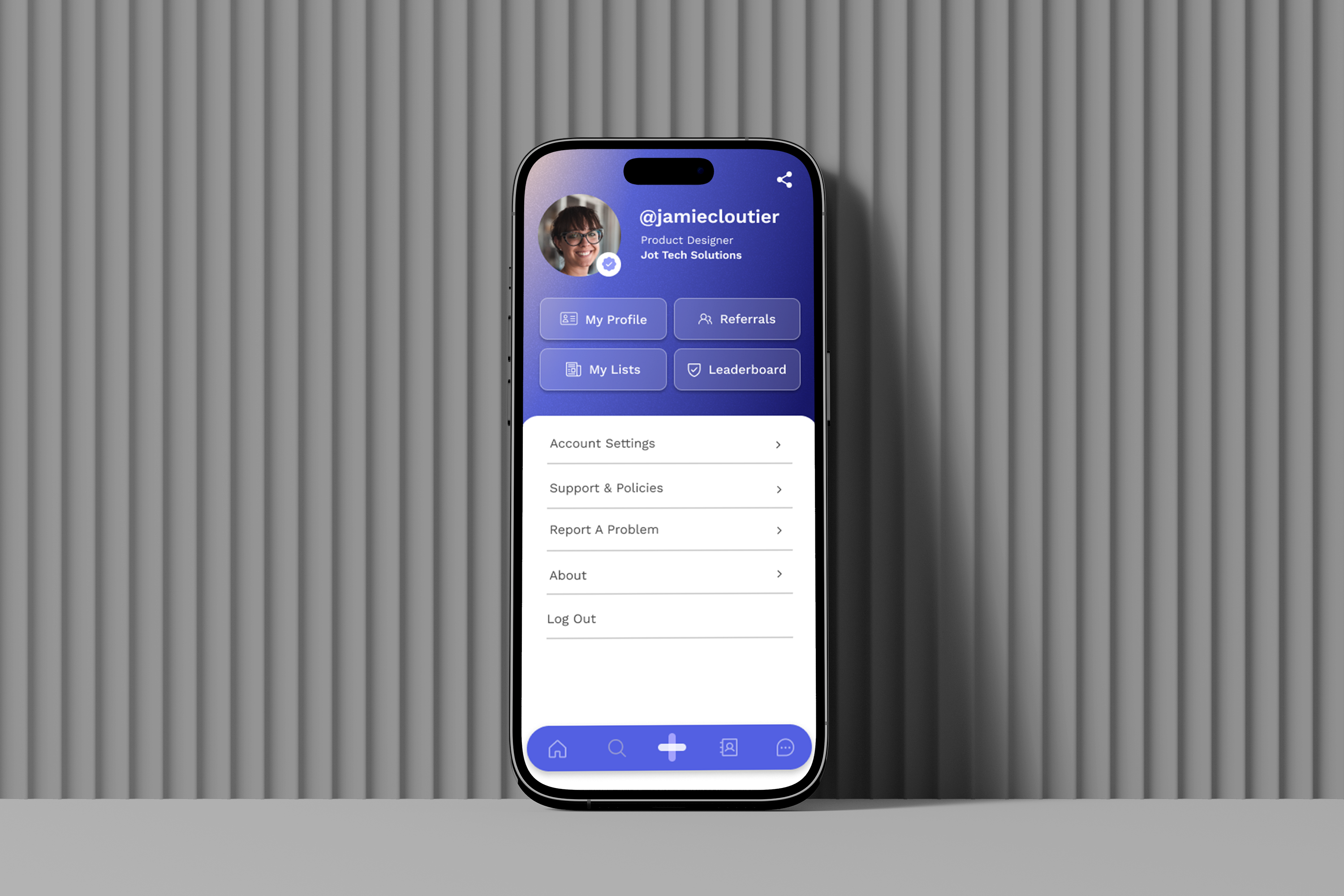
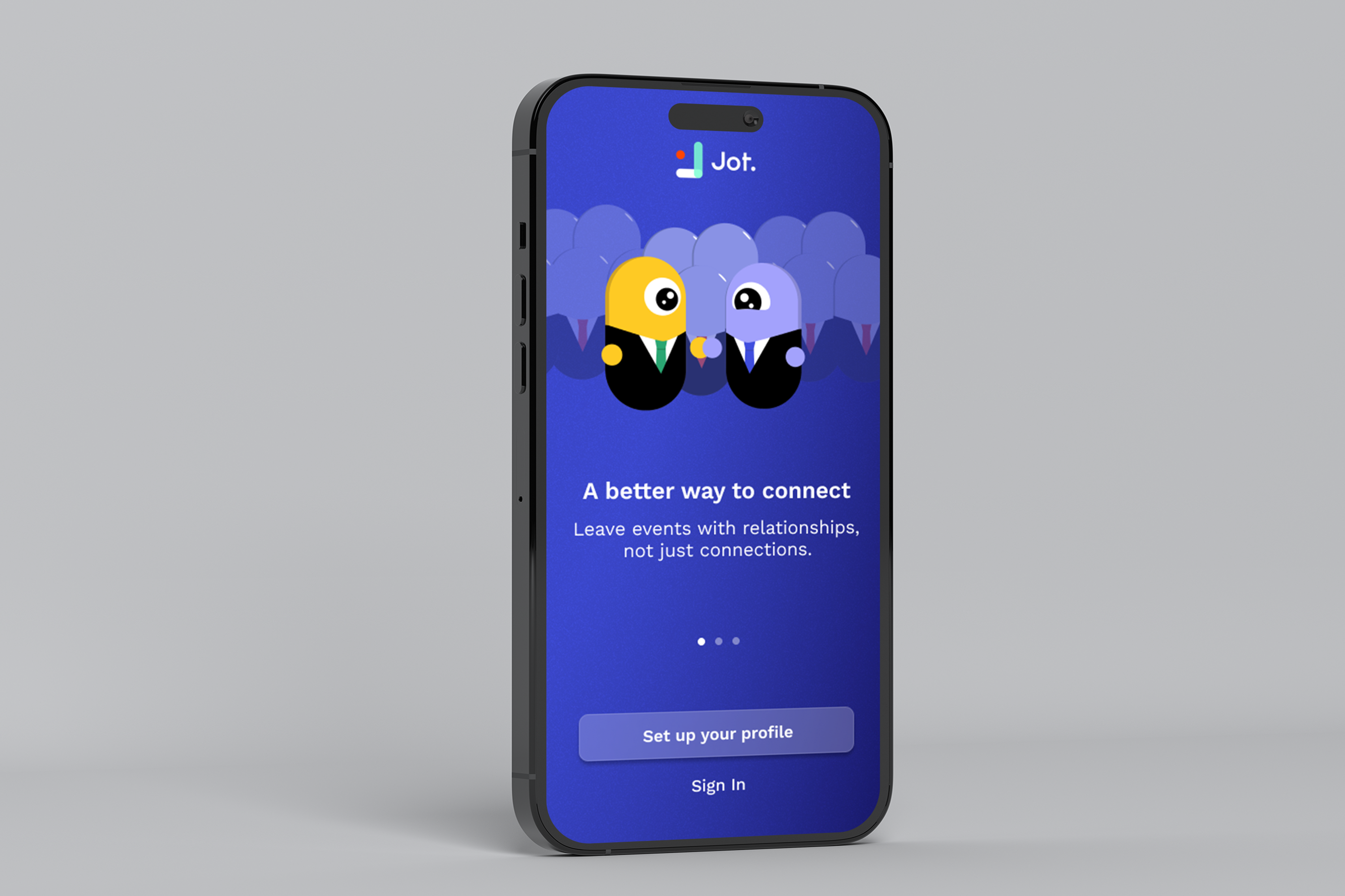
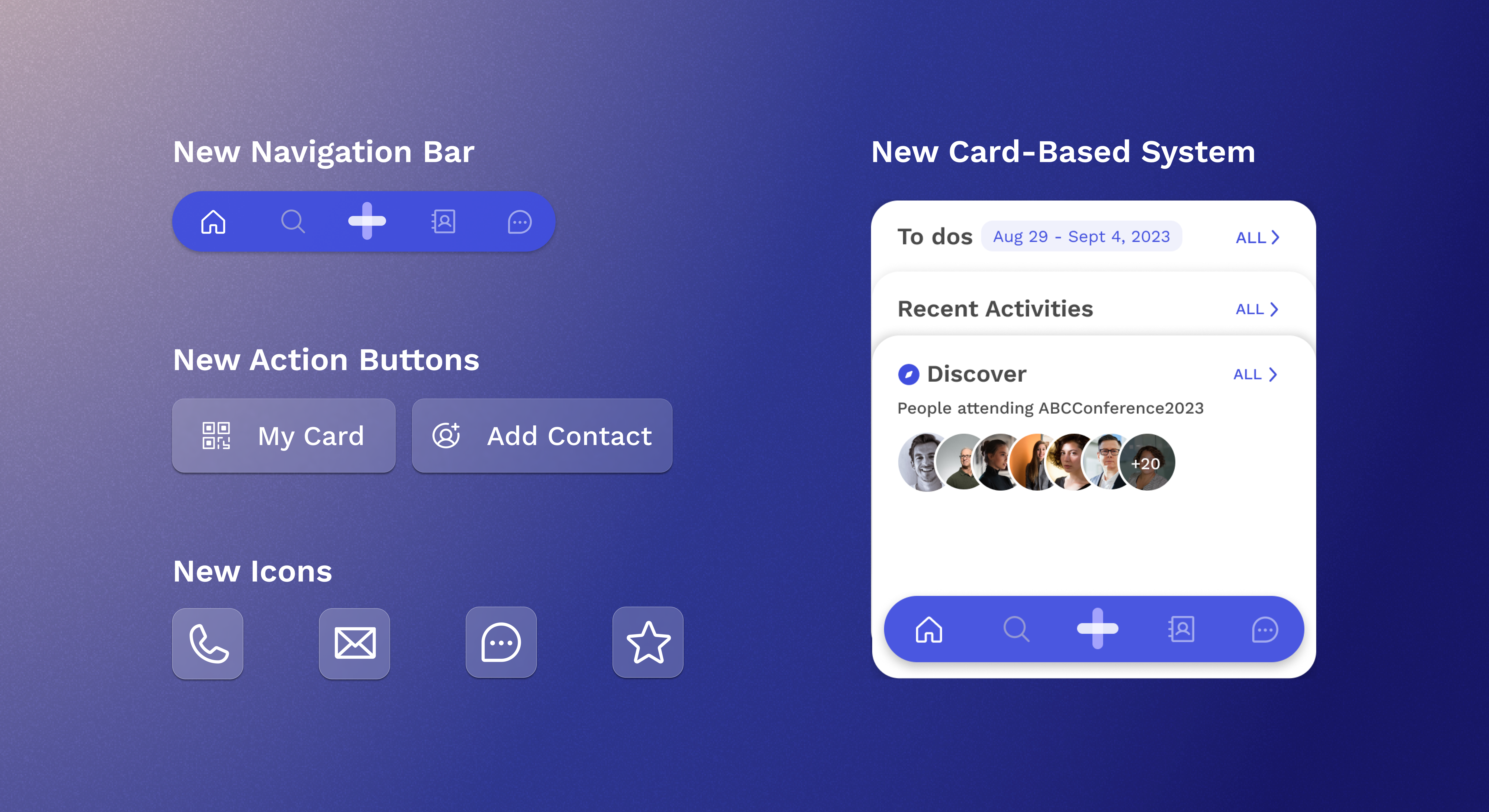
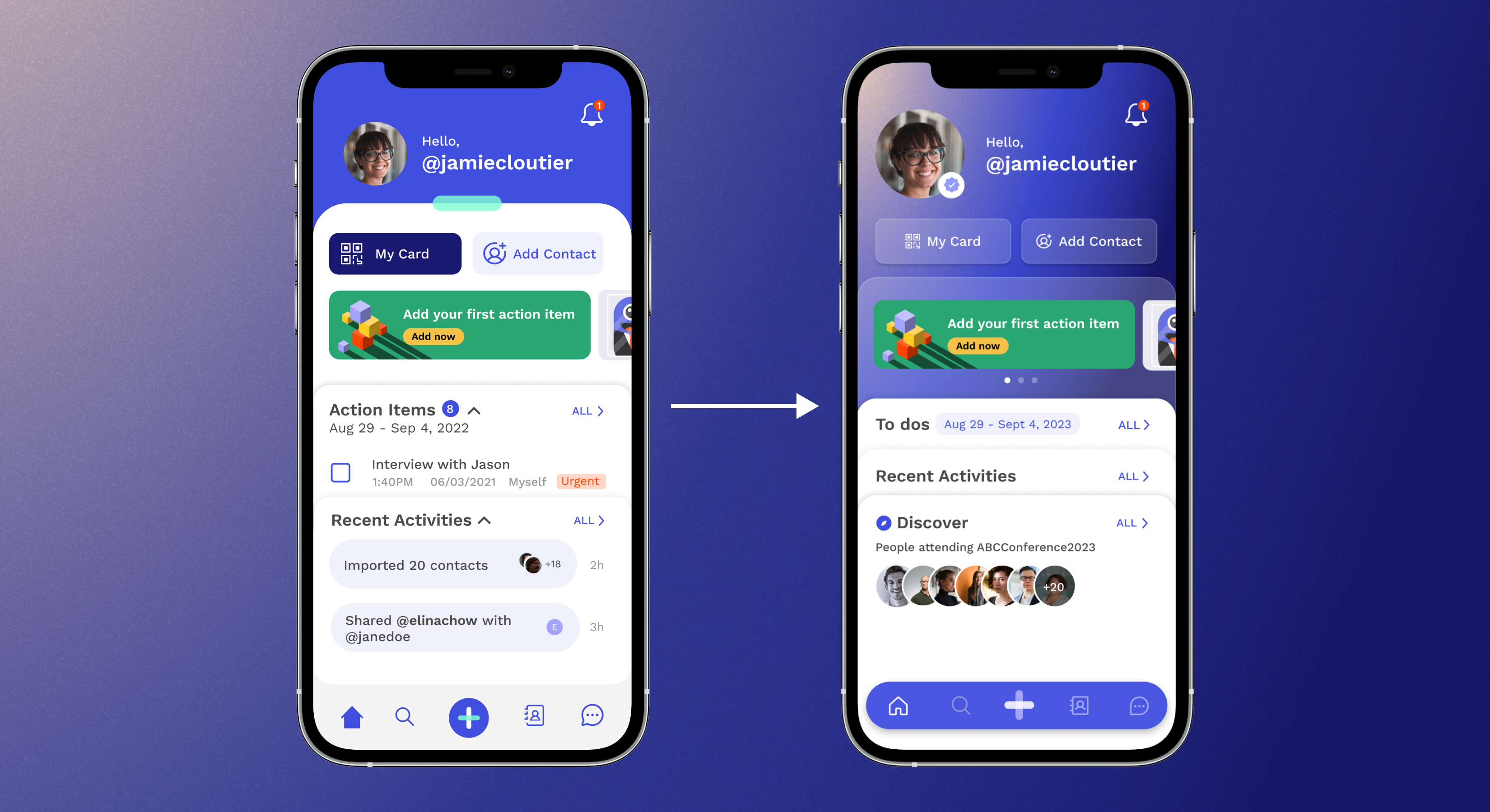
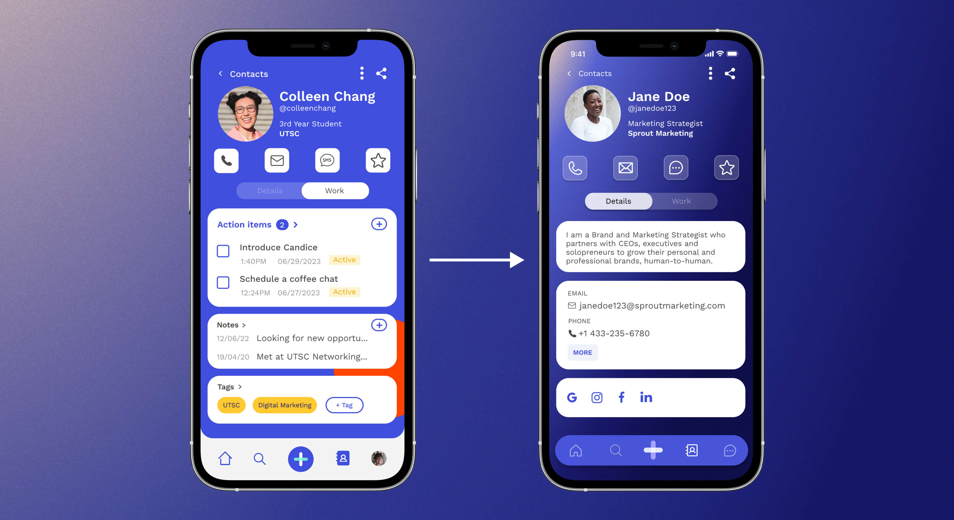
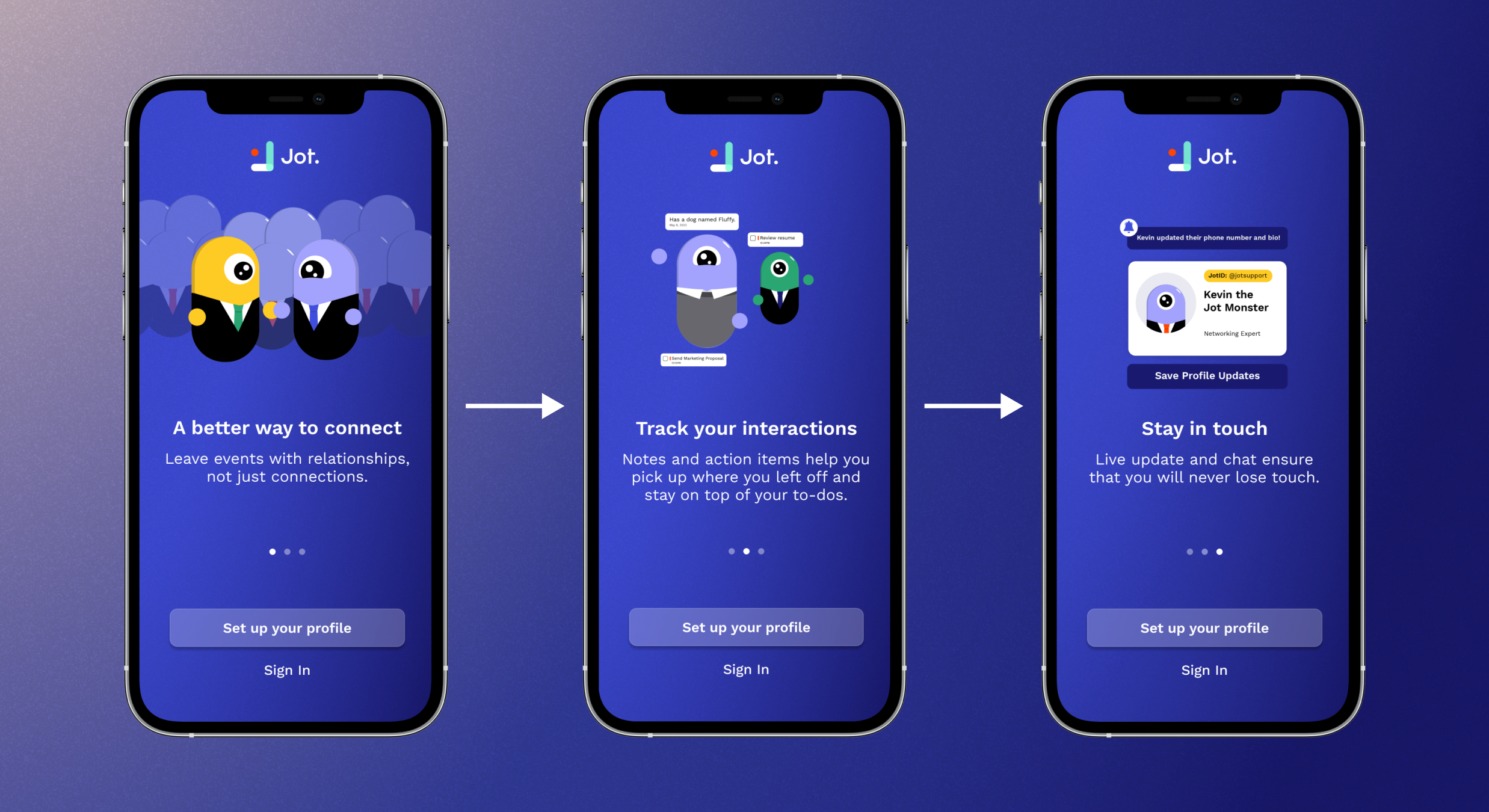
✦ Visual Design System

To address the concerns that our UI was outdated and “ugly”, we decided to incorporate a new visual design system. We used a muted gradient for our background to draw more attention to our components instead. Then, we incorporated a more minimal “frosted-glass” design system for our buttons and components. We also decided to redesign the navigation system, creating an easier to understand, more modern design. Finally, we switched up some of the icons to be more inline with modern standards.

✦ Coherence and Overload

To address the mental overload and coherence issues, we decided to employ a “card” system in our home screen and have cascading tabs to hide some information. We also decided to add a “show more” button on the contacts page to reduce the amount of information visible at once. Additionally, through the new visual design system, we were able to increase the contrast between the action items and other components.
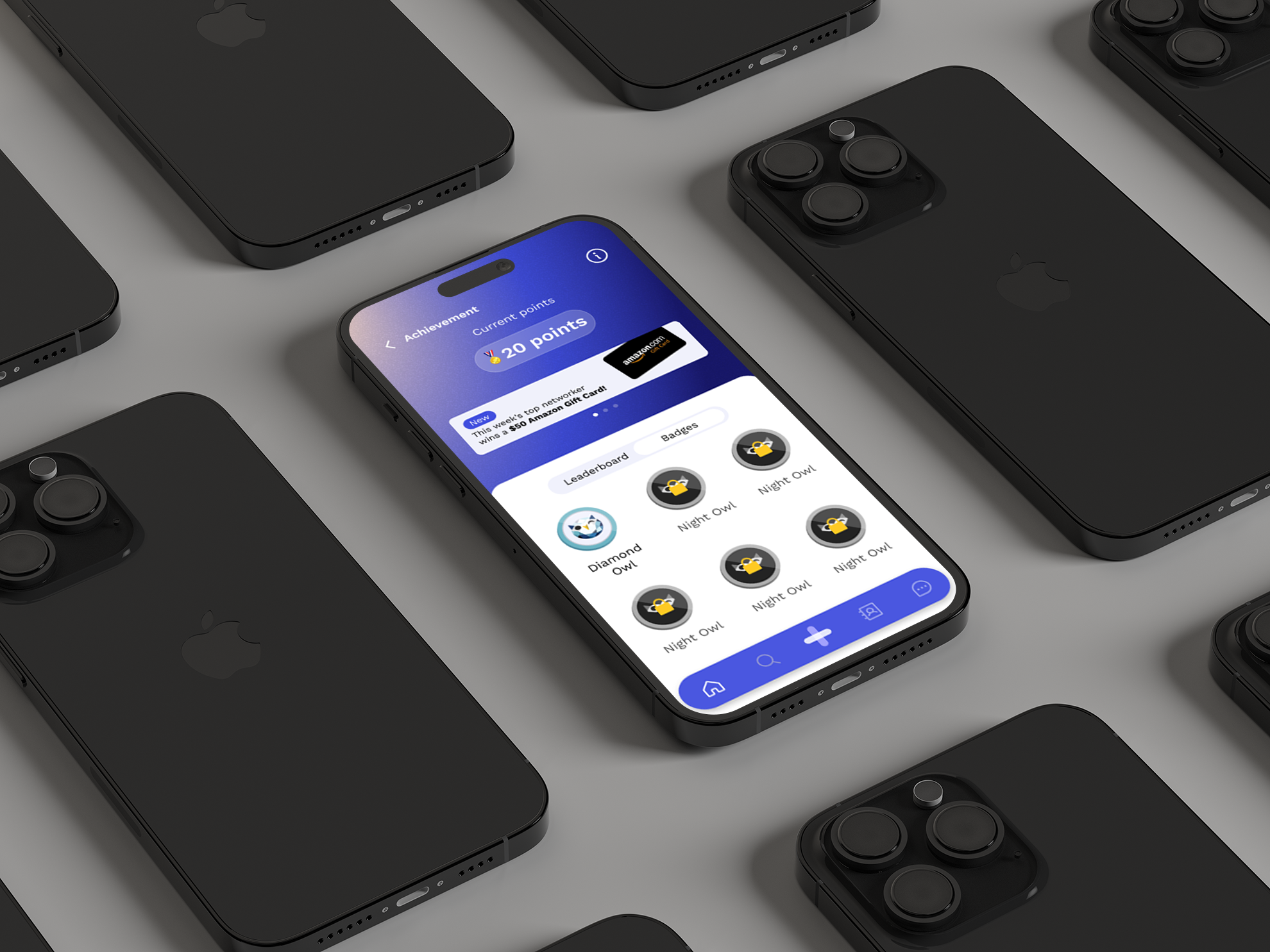
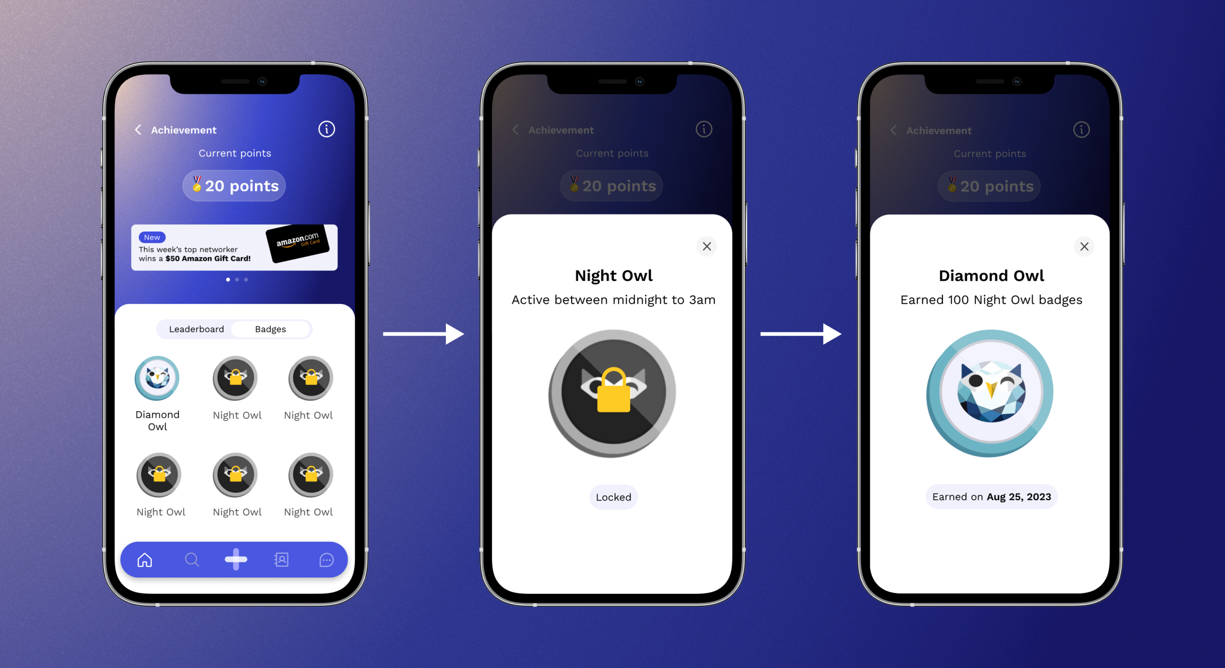
✦ Addressing Churn

To address churn, we incorporated gamification in the form of badges and achievements, as well as introduced an onboarding screen for new users entering the app for the first time. Since both of these were new features, they immediately adopted the new visual design system. The onboarding screen would feature the new mascot, Kevin.

Figure 4 - New onboarding page, using the new visual design system.

Figure 5 - New leaderboard page and badge system, using the new visual design system. Not a true representation of the badges available.

✦ Addressing Low Conversion Rate

To address the low conversion rate, we introduced a new feature that was mostly locked behind a paywall: a discovery page that took advantage of geolocation to find new connections that were attending the same event as you. Naturally, this also used the new visual design system. Unfortunately, being an unreleased feature, I cannot show the prototype due to the NDA I signed.

Phase 3 - USer Testing & Launch

✦ User Testing

After prototyping the new screens and testing the new visual design system within the team, we conducted user testing at Collision Conference 2023. We asked users to conduct a short survey, evaluating the usefulness of the new features, as well as asking questions regarding the new design of the app. This time around 90% of the feedback we received was positive.

We also reconducted a similar survey at the University of Toronto, Scarborough. We found that more students were reacting positively to the new design, with no comments of the app being ugly and/or outdated.

✦ Launch

With the redesign complete, we pushed our new UI onto the Apple App Store and the Google Play Store.

✦ Disclaimer

3 months after I finished my work at Jot Contact Manager™, the company closed its doors permanently. This included the removal of the app from the Apple App Store and Google Play Store, as well as all social media presence.

Check out my other projects!

Oasis Relief Fund

Habitual Studio